Why Navigation is Important in UI/UX Design
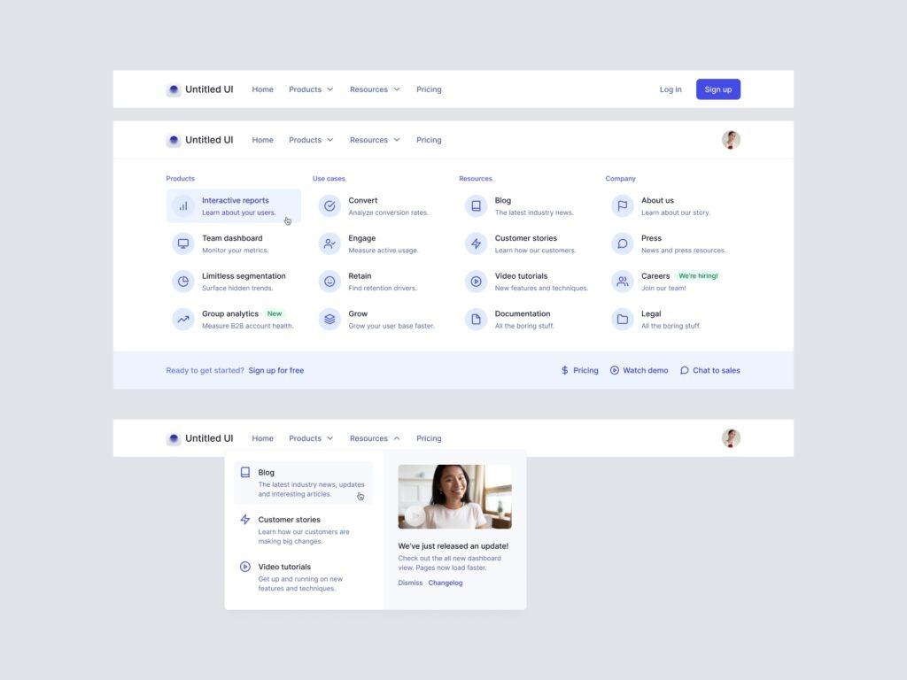
The average attention span of a human being is eight seconds. That means you have eight seconds to make a good impression on your website visitors. If your website is challenging to navigate, chances are they will leave before they even get started. Good navigation should be intuitive and easy to use. The last thing you want is your visitors to get frustrated trying to find what they’re looking for.
A good rule of thumb is to keep your navigation simple and easy to understand. Stick to the basics: home, about, products/services, contact. If you have too many options in your navigation menu, it will only serve to confuse visitors.
Hot Trends in Navigation
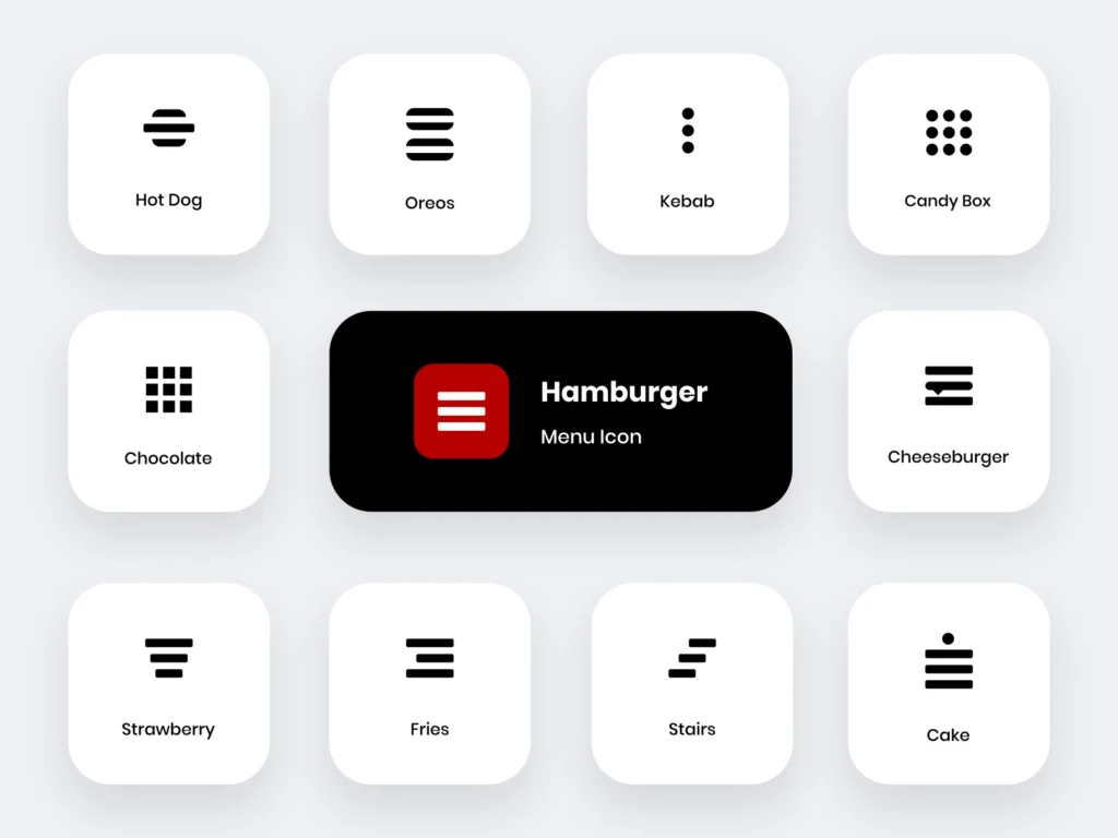
One of the hottest trends in navigation right now is the hamburger menu. This type of menu condenses all your navigation options into one icon that can be accessed with a single click. This is a great way to keep your navigation clean and simple while still providing visitors with all the information they need.
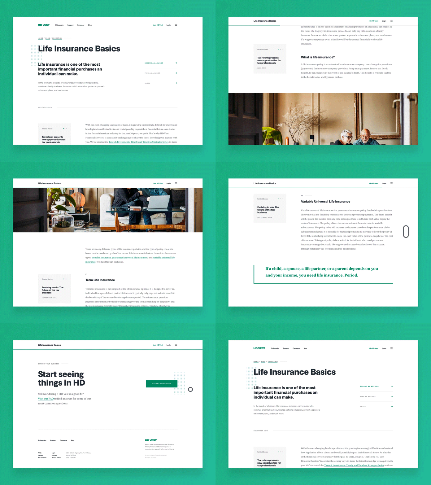
Another popular trend is the sticky header. This type of header remains at the top of the page as users scroll down, making it always accessible. This can be extremely helpful if your website has a lot of content or if you have several different pages that you want visitors to be able to access quickly and easily.
Why Simplification is Important in UI/UX Design
In addition to being easy to navigate, your website should also be simple and straightforward. Again, you only have eight seconds to make a good impression, so you want visitors to be able to understand what your website is about immediately. If your website is cluttered or confusing, chances are visitors will click away before they even have a chance to figure it out.
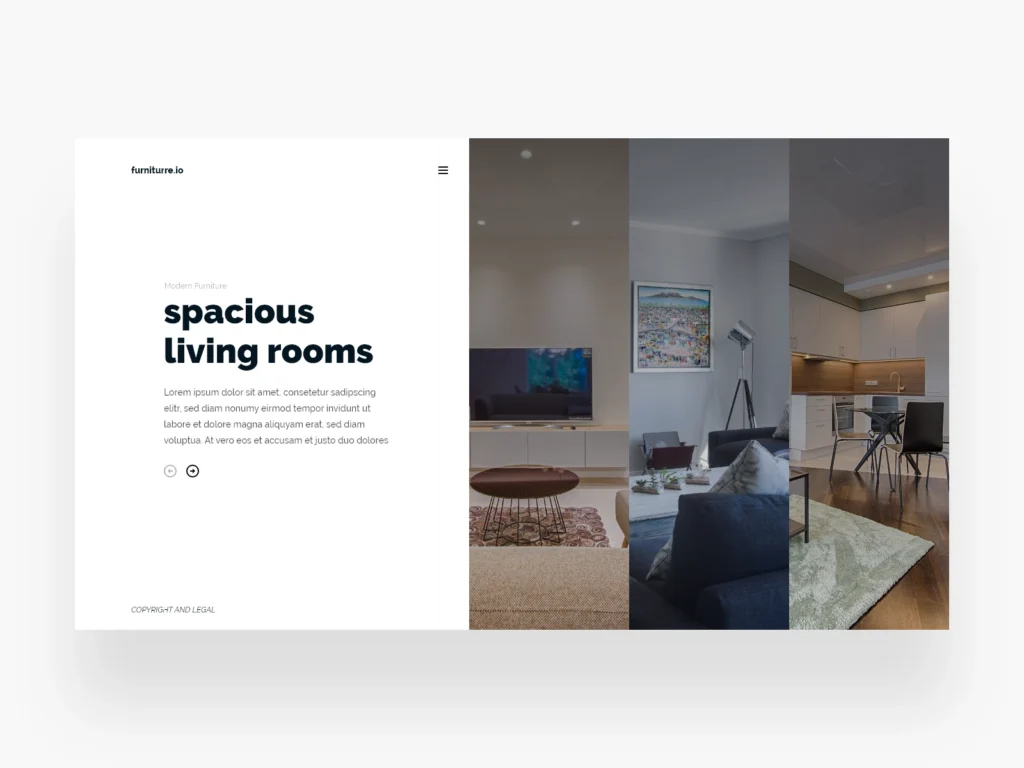
An excellent way to simplify your website is to use whitespace effectively. Whitespace is the empty space on a page that serves as a buffer between different elements. By using whitespace strategically, you can create a more visually appealing website that is easier for visitors to digest.
Conclusion
In today’s fast-paced world, you only have eight seconds to make a good impression on potential customers visiting your website for the first time. That’s why it’s crucial to have a well-designed site that is easy to navigate and understand. Good UI/UX design should be intuitive and straightforward, with simple navigation, and effective use of whitespace. By following these principles, you can create a website that will keep visitors engaged and coming back for more. Contact Us


